Post by nessyo on May 1, 2013 8:56:39 GMT -5
now with it's own thread!
Tutorial
19 minutes. Video. Sound required, unfortunately. :C
As the staff requested, the nessbeast provides~
This is just a bag of tricks. putting these together is what makes your design.
Click me!
Some things I forgot to mention:
- I said it takes an hour; I meant to say it takes at least an hour. Designs take time.
- Lots of layers. lots and lots of layers. what ends up making most designs work is that there's a lot of mark making on top of different kinds of mark making. My designs are small if they're 10 layers thick.
- Treat this like a painting, if that helps. It's jsut a horse shaped canvas. :3 Good designs basically use the same principles as abstract expressionism.
- don't be afraid to try things. use lots of colors, lots of shades of what colors you are using, and lots of different kinds of marks,
- Some things are not going to work. another reason to put your markings on separate layers. :3 just turn off the layer. You won't know it until you're actually doing it.
- I don't use every technique on every design. :3 use them where they make sense.
Brief text summary of what's in the video:
I really still recommend you watch it, because most of these things are a set of photoshop commands and it's hard to understand what's happening until you see it live.
- Start on a gradient. This creates more visual interest then not. Try to use off-white instead of white, because white washes things out.
- highly saturated or very bright colors tend to be distracting, so use them sparingly. They shine the best when you pair them with drabber colors.
- Color theory color theory color theory. If your designs work on a color front, they'll usually work in other respects.
- I use 3 brushes, primarily. The pressure-sensitive pressured round, the soft version of that brush, and the extra-soft version of that brush with more feathering (See the video). Those brushes can do just about anything.
- Opacity and brush size + those three brushes are important.
- Localized gradients are as useful for creating markings as brushes are
- The eraser can be a brush too, especially if you want to reveal some of the color or markings underneath. For example, if i were to add a gradient of neon pink on a horses's topline, and then do the top half of the horse's body in a black gradient, btu i wanted the pink to show through, I could erase stripes into the black layer to show the pink. This only works when the thing you're erasing is on a different level from what you're revealing.
- On that note, pay attention to your layers: a new marking on a different layer is a good habit to get into.
- You can also transparency lock a layer and draw markings on markings or gradients you've already created: for example, say I've got a roan gradient going on, and I want stripes on the darker parts (which I created via localized gradients). I can lock the layers with the darker parts, and draw on them when they're transperency locked, creating stripes that fade at the same rate as the gradient.
- Other brushes, particularly textural brushes, have limited use. Don't use them too much-- too much texture or visual chaos can work against you by creating color diffusion or noise, which will distract from your lines (and shading, if it's present), resulting in an uncomfortable visual tension for your viewer and mroe attention being given to the color-blob then to the entire piece, lines and all. You want all parts of this to work harmoniously. So, use them sparingly. They're good for things like spots.
- Also use them sparingly because they can look very stiff. Where possible, it's best-- when you've been using a brush of that nature-- to go in afterwards with your tapered regular brush and add in similar marks with your own hand, or weave them together with some other sort of mark-making, that's made by your own hand.
-mark making is very important-- stripes, lines, dopts, splotches. go wild. especially if it's made by your own hand, it really does look tje best.
- Photoshop filters are useful, but in a limited capacity, and again, it's best to go in after you use them and add to them with the eraser and/or your regular tapered brush.
Not mentioned in vid:
- This is a personal opinion, but I think refs work better on flat bases rather then shaded templates. I think this because shading does distort colors, so when you're picking a color off of a ref, it's much easier to tell what a color is doing and what color it is if the ref is not shaded. Shaded pieces are wonderful, but they have limtied usefulness as refs. Of course, this is an artistic preference-- this one is just mine, from before I joined this game. :3 There are valid reasons to use a shaded template over a flat one-- but either way, it is something whose pros and cons you should think about and weigh for yourself, and make an informed decision about. ^^
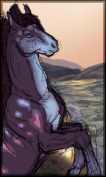
- When doing your own refs/drawing them yourself, I personally find it more useful to choose poses which reveal the entire side, rather then 3/4's or more turning. You want to show the maximum amount of marking so that people can emulate the design, and you want to do it without the mild foreshortening distortion created by angled views. 3/4's is probably the most amount of foreshortening that can still translate useful information in a ref. So yeah- pick your pose carefully.
Tutorial
19 minutes. Video. Sound required, unfortunately. :C
As the staff requested, the nessbeast provides~
This is just a bag of tricks. putting these together is what makes your design.
Click me!
Some things I forgot to mention:
- I said it takes an hour; I meant to say it takes at least an hour.
 Designs take time.
 - Lots of layers. lots and lots of layers. what ends up making most designs work is that there's a lot of mark making on top of different kinds of mark making. My designs are small if they're 10 layers thick.
- Treat this like a painting, if that helps. It's jsut a horse shaped canvas. :3 Good designs basically use the same principles as abstract expressionism.
- don't be afraid to try things. use lots of colors, lots of shades of what colors you are using, and lots of different kinds of marks,
- Some things are not going to work. another reason to put your markings on separate layers. :3 just turn off the layer. You won't know it until you're actually doing it.
- I don't use every technique on every design. :3 use them where they make sense.
Brief text summary of what's in the video:
I really still recommend you watch it, because most of these things are a set of photoshop commands and it's hard to understand what's happening until you see it live.
- Start on a gradient. This creates more visual interest then not. Try to use off-white instead of white, because white washes things out.
- highly saturated or very bright colors tend to be distracting, so use them sparingly. They shine the best when you pair them with drabber colors.
- Color theory color theory color theory. If your designs work on a color front, they'll usually work in other respects.
- I use 3 brushes, primarily. The pressure-sensitive pressured round, the soft version of that brush, and the extra-soft version of that brush with more feathering (See the video). Those brushes can do just about anything.
- Opacity and brush size + those three brushes are important.
- Localized gradients are as useful for creating markings as brushes are
- The eraser can be a brush too, especially if you want to reveal some of the color or markings underneath. For example, if i were to add a gradient of neon pink on a horses's topline, and then do the top half of the horse's body in a black gradient, btu i wanted the pink to show through, I could erase stripes into the black layer to show the pink. This only works when the thing you're erasing is on a different level from what you're revealing.
- On that note, pay attention to your layers: a new marking on a different layer is a good habit to get into.
- You can also transparency lock a layer and draw markings on markings or gradients you've already created: for example, say I've got a roan gradient going on, and I want stripes on the darker parts (which I created via localized gradients). I can lock the layers with the darker parts, and draw on them when they're transperency locked, creating stripes that fade at the same rate as the gradient.
- Other brushes, particularly textural brushes, have limited use. Don't use them too much-- too much texture or visual chaos can work against you by creating color diffusion or noise, which will distract from your lines (and shading, if it's present), resulting in an uncomfortable visual tension for your viewer and mroe attention being given to the color-blob then to the entire piece, lines and all. You want all parts of this to work harmoniously. So, use them sparingly. They're good for things like spots.
- Also use them sparingly because they can look very stiff. Where possible, it's best-- when you've been using a brush of that nature-- to go in afterwards with your tapered regular brush and add in similar marks with your own hand, or weave them together with some other sort of mark-making, that's made by your own hand.
-mark making is very important-- stripes, lines, dopts, splotches.
 go wild. especially if it's made by your own hand, it really does look tje best.
- Photoshop filters are useful, but in a limited capacity, and again, it's best to go in after you use them and add to them with the eraser and/or your regular tapered brush.
Not mentioned in vid:
- This is a personal opinion, but I think refs work better on flat bases rather then shaded templates. I think this because shading does distort colors, so when you're picking a color off of a ref, it's much easier to tell what a color is doing and what color it is if the ref is not shaded. Shaded pieces are wonderful, but they have limtied usefulness as refs. Of course, this is an artistic preference-- this one is just mine, from before I joined this game. :3 There are valid reasons to use a shaded template over a flat one-- but either way, it is something whose pros and cons you should think about and weigh for yourself, and make an informed decision about. ^^
- When doing your own refs/drawing them yourself, I personally find it more useful to choose poses which reveal the entire side, rather then 3/4's or more turning. You want to show the maximum amount of marking so that people can emulate the design, and you want to do it without the mild foreshortening distortion created by angled views. 3/4's is probably the most amount of foreshortening that can still translate useful information in a ref. So yeah- pick your pose carefully.